
June 24, 2026
Vehicle wrap design lives or dies in a few seconds of viewing. This playbook covers the brief, visual hierarchy, contrast and legibility at distance, colour that survives outdoors, working with seams and glass, print-ready files and the legal limits on plates, windows and lighting.
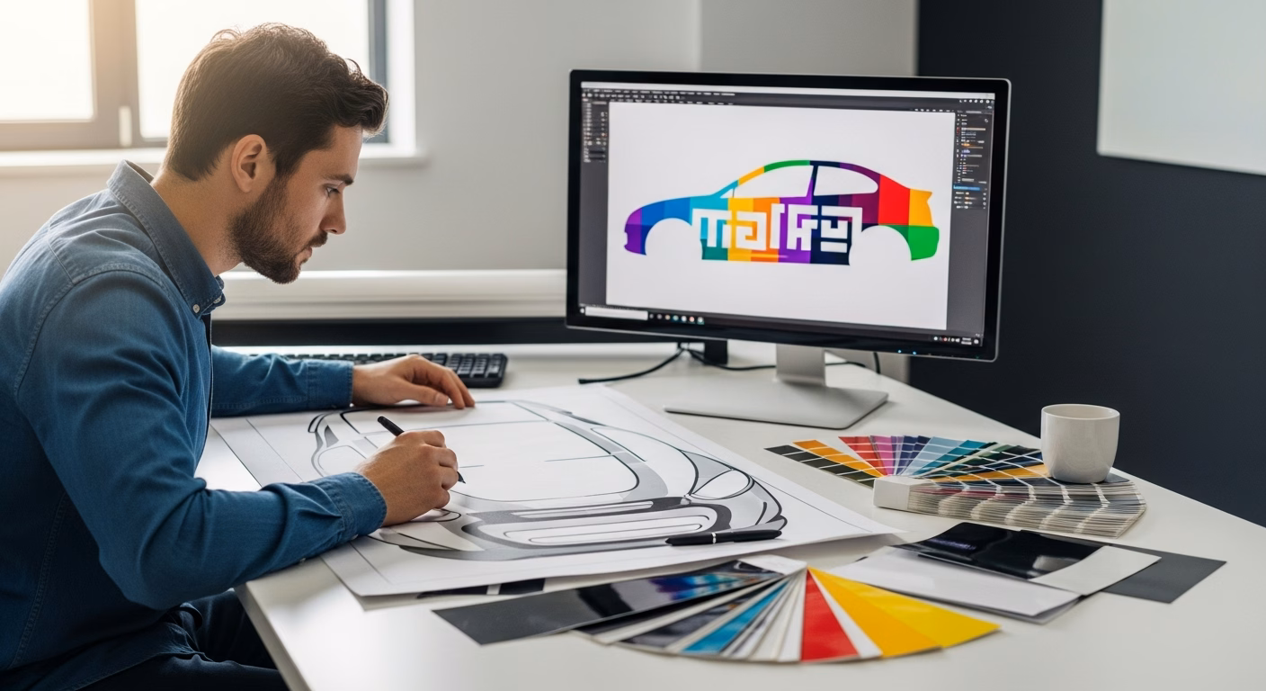
A vehicle wrap has roughly the attention span of a traffic light. A passer-by, a driver at a junction or a pedestrian on a pavement sees the artwork for a few seconds, often in motion, then it is gone. That single constraint shapes every decision in vehicle wrap design, from the size of the phone number to the choice between two shades of blue.
Good design on a moving surface is not the same as good design on a screen or a flyer. The canvas is curved, interrupted by seams and handles, viewed from changing angles and read at speed. A layout that looks balanced on a flat artboard can collapse into noise once it is stretched across doors, wheel arches and a tailgate. The brief, the hierarchy and the legal limits matter as much as the visuals.
This playbook covers the order of operations that produces a wrap that actually performs: starting from a brief rather than a blank canvas, building a clear visual hierarchy, designing for distance and contrast, respecting the shape of the bodywork, preparing files for large-format print, and staying inside the rules that govern plates, glass and lighting.
The most common cause of a weak wrap is design that begins before anyone has decided what the wrap is for. A delivery van that needs to be remembered at a distance has a different brief from a showroom demonstrator that will be photographed up close. Before any layout, the brief should fix the single most important thing a viewer must take away, the audience and the typical viewing situation, and the one action the wrap should prompt.
That clarity also depends on understanding the medium itself. A wrap is printed vinyl film conformed to the bodywork, so it inherits the strengths and limits of the material. A short explanation of what a vehicle wrap is for a business helps frame realistic expectations before the creative work starts. The brief should note whether the project is a full wrap, a partial wrap or simple lettering, because each gives the designer a very different amount of surface to work with.
A wrap is not a brochure. The eye cannot scan it at leisure, so the design has to decide for the viewer what to read first. A clear visual hierarchy places one dominant element, usually the brand name or the core promise, then a single supporting line, then the contact route. Anything beyond three levels of information tends to be ignored at speed.
Restraint is the hardest part of the brief to defend, because every department wants its detail on the vehicle. The discipline is to treat empty space as a feature rather than wasted area. A logo, five or six words and one way to make contact will outperform a dense panel that lists every service, accreditation and social handle. Secondary information belongs on a website, not on a tailgate seen for three seconds.
The same hierarchy logic governs finish choices. A bold matte field can act as a calm background that lets type stand out, which is one reason a matte black vehicle wrap is often paired with a single bright accent colour. A clean light base behaves differently again, and the trade-offs of a white vehicle wrap as a backdrop for graphics are worth weighing during the layout stage.
Legibility is measurable, not a matter of taste. Sign professionals work to a legibility index that ties letter height to readable distance, with a widely used field rule of roughly three metres of comfortable reading distance for every centimetre of capital letter height. A phone number meant to be read from across a car park therefore needs characters far larger than most first drafts allow.
Typeface choice follows the same logic. A clean sans serif typeface holds its shape at distance and at speed far better than a script or a fine serif, where thin strokes disappear and letters merge. The general principle of legibility favours generous letter spacing, short lines and a limit of one or two typefaces across the whole vehicle.
A simple test settles most arguments: the artwork is printed small, pinned up, and viewed from the back of the room. If a detail has to be squinted at, it is too small or too fussy for a vehicle that will be seen for a fraction of that time. The same check can be run digitally by zooming the layout out to thumbnail size.
Contrast carries the message before colour does. High contrast between text and its background, dark type on a light field or the reverse, is what lets a wrap read at distance and in poor light. The accessibility world has quantified this in the WCAG contrast guidance, and the same ratios that help low-vision readers on screen translate directly into a wrap that works at forty miles an hour.
Colour relationships do the rest. Pairs drawn from opposite sides of the colour wheel, the complementary colours, produce the strongest separation between a graphic and its ground. A palette of two or three colours, used consistently, reads as a brand; a palette of seven reads as clutter.
Outdoor durability also shapes the palette. Strong reds and some fluorescents fade faster under ultraviolet light than neutral tones, so a design that depends on a single saturated red will age less gracefully than one built on a stable core colour. Material choice interacts with this, which is why the design conversation and the vinyl vehicle wrap materials decision belong together rather than in sequence.
The bodywork is the hardest constraint and the one most often ignored on a flat artboard. Door seams, handles, fuel flaps, mirrors, recessed bumpers and sharp curves all sit in the middle of the canvas. A face, a logo or a key word placed across a door shut line will be split when the door opens, and text wrapped over a deep recess distorts.
The practical method is to design on an accurate template of the specific make and model, with the panel gaps, glass and hardware marked. Important elements are then positioned on flat, uninterrupted areas: the lower doors, the rear quarter and the tailgate. Background patterns and colour fields can run across seams freely, but type and logos should sit where they stay whole.
Edges need room as well. Large-format wrap files are built with a generous bleed, often several centimetres beyond each panel edge, so the film can be wrapped around lips and into channels without the printed design stopping short. Designing right up to the visible edge with no margin almost guarantees a thin unprinted line once the film is tucked.
A wrap is printed at full vehicle scale, so the artwork has to survive enormous enlargement. Logos, text and shapes should be supplied as vector graphics, which scale to any size without losing their edges. Photographs cannot be vectorised, so any image used has to carry enough resolution at the final printed size rather than at screen size.
Colour management is the other half of print-readiness. Screens display in additive light while large-format printers lay down ink, so files are prepared in the CMYK colour model to avoid surprises between the proof and the panel. Where an exact brand colour matters, a defined reference such as a Pantone value gives the printer a target rather than a guess.
A short pre-press checklist saves expensive reprints: vector logos embedded or outlined, raster images at adequate resolution, the document in CMYK, bleed added around every panel, and a flattened proof viewed at the size a passer-by will actually see. The same simulation logic sits behind an online configurator, where a design can be previewed on the vehicle before any film is cut.
Some of the strongest design constraints are legal rather than aesthetic, and they are easier to respect at the layout stage than after printing. Number plates must remain fully visible and legible, so no graphic, border or colour field may encroach on them; the rules on displaying number plates set out the format that must stay clear.
Glass is the next limit. The front windscreen and front side windows must keep a minimum light transmission, so solid film cannot run across them; the tinted vehicle window rules define the thresholds, and a designer routes graphics around the glass that must stay clear. Rear and side windows can carry perforated one-way vision film instead. The broader duty to keep the driver's view unobstructed sits in the Road Vehicles (Construction and Use) Regulations 1986.
Two further points catch designs out. A full colour change has to be reported on the registration document, as the guidance on updating a registration certificate explains, so a colour-change wrap is an administrative step as well as a creative one. And reflective or coloured lighting effects near the lamps are restricted by the Road Vehicles Lighting Regulations 1989, while general roadworthiness expectations are summarised in the Highway Code. A design that ignores these may need reworking after the fact.
A single wrap is a graphic; a fleet is a system. When the same artwork has to sit on a small car, a panel van and a box lorry, the design cannot be a fixed picture. It has to be a set of rules: where the logo sits, how the core colour fills the body, how the message scales up and down, and which elements drop away on the smallest vehicles.
Consistency is what turns several vehicles into a recognisable presence on the road. A flexible master layout, expressed as proportions rather than fixed positions, lets each body shape carry the same identity without forcing identical artwork onto very different surfaces. This is the same discipline that underpins wrap advertising as a measurable channel rather than a one-off decoration.
The subject of this article connects with several services offered by Brands And Markets. For projects that need text and decals rather than a full graphic, the page on vehicle lettering and decals sets out the simpler end of the design spectrum.
For a structured project, a fleet roll-out or a manufacturer line-up, the range animation for vehicle line-ups approach keeps one design system across many bodies, and the online configurator allows a layout to be previewed on the vehicle before production.
Vehicle wrap design rewards subtraction. The wraps that perform are the ones built around a single message, set in high contrast and a legible typeface, positioned to respect seams and glass, and prepared as clean vector files at the right scale. Density is the enemy of a surface that is read in seconds.
The most reliable path is to settle the brief and the legal limits first, then design backwards from the viewing distance, and only then refine the colours and the finish. A preview through an online configurator turns those decisions into something a decision-maker can see on the actual vehicle before any film is printed.
An effective wrap reads in a few seconds at street distance and in motion. It carries one dominant message, supported by at most a couple of secondary lines, set in high contrast between text and background. A single legible sans serif typeface, generous letter height and clear space around the key elements do more than any added graphic. Seams, handles and glass are left clear so nothing is split or hidden when a door opens. The test is simple: if the layout cannot be read at thumbnail size, it will not read on a moving vehicle either. Restraint, not density, drives recall.
Logos, text and flat shapes are supplied as vector artwork, because vectors scale to full vehicle size without losing crisp edges. Photographs cannot be vectorised, so each image has to carry enough resolution at the final printed dimensions, not just at screen size. The whole document is built in the CMYK colour model to match large-format ink output rather than screen light, with key brand colours pinned to a defined reference value. A generous bleed is added beyond every panel edge so the film can wrap around lips and into channels without the print stopping short. A flattened proof, checked at realistic viewing size, completes the pre-press stage.
A full colour change has to be recorded on the V5C registration certificate, since the document lists the vehicle's colour. Partial graphics or lettering that leave the original body colour dominant generally do not require an update. Whatever the design, the number plates must stay fully visible and legible, and no part of the artwork may obscure them. Treating the registration step as part of the project plan, rather than an afterthought, avoids problems at resale or at a roadside check. A colour-change wrap is therefore an administrative task as well as a creative one, and the timing is worth confirming before the film goes on.
Side and rear windows can carry perforated one-way vision film, which shows the design from outside while the occupants see out. The front windscreen and front side windows are different: they must keep a minimum light transmission so the driver's view stays clear, which means solid film cannot run across them. A good design routes graphics around the glass that has to remain unobstructed and treats the window line as a deliberate edge rather than a surface to fill. Planning this at the layout stage avoids a redesign once the legal limits are checked, and it keeps the finished wrap both compliant and visually coherent.
Prêt à transformer votre projet ? Discutons de vos besoins et de la manière dont nous pouvons collaborer.
Adresse : 28 rue Fresnel – F-78310 COIGNIERES
Téléphone : 01 85 40 01 75